The Project
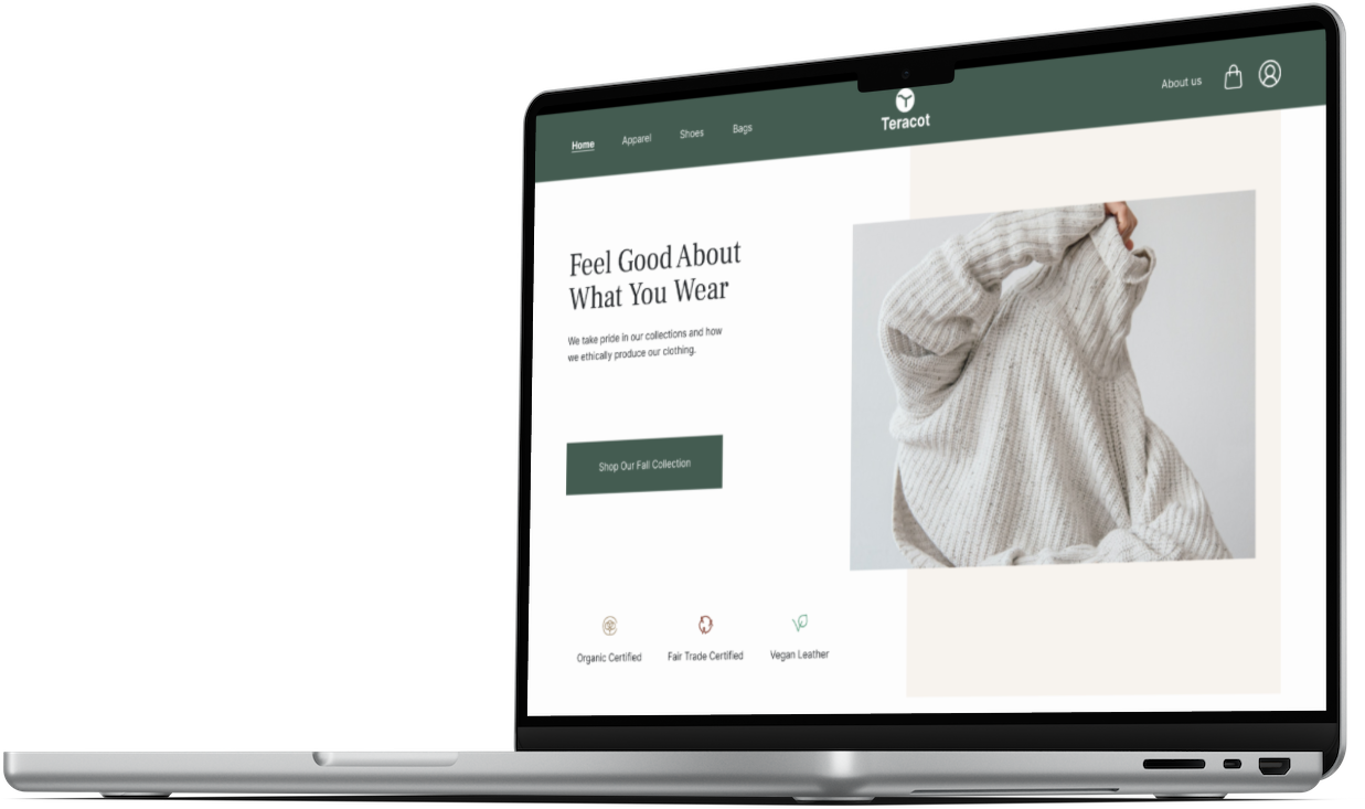
Teracot is an imaginary sustainable fashion e-commerce website that I created as part of my Google UX Certification course on Coursera.
My Role: UX designer, I designed this project from inception to final design
Applied Skills: User interviews, competitor analysis, user personas, sitemaps, paper wireframes, lo-fidelity prototyping, usability testing, iterating designs, UI moodboards, hi-fidelity prototyping,
Achievements: Designed a well organized, easy to use, and easy to find fashion e-commerce website for sustainable apparel.
Learnings: It is so important to really dive into who your user is and ask them questions to better understand their point of view. Users will surprise you with their answers, which ultimately create a product that meets their actual needs. I really enjoyed the UI part of this project- choosing the color scheme, layout, and overall aesthetic feel of the product.
Users are having a hard time finding sustainable fashion websites that clearly state why the clothes are sustainable or ethically made.
The Problem
Teracot is an imaginary sustainable small retailer located in Boston, MA that provides apparel, shoes and bags for shoppers who want to buy and wear items that are ethically and sustainably sourced.
Target users are young-mid adults interested in buying sustainable clothing.
The Client
Design a delightful and well-organized e-commerce experience that clearly exhibits why the products are sustainable while being easy to navigate and find products .
My Goal
Research
The first stage of this project was to better understand what Teracot’s business needs were, who their target user was and what their needs were.
With the goal of understanding what retail shoppers specific needs were, what features they thought were most important on a digital experience, and the pain points they were experiencing when buying sustainable clothing online- I conducted interviews with users who are familiar with online shopping. I interviewed four participants between the ages of 28 and 55. I chose this age group based on research I conducted that stated Millennial’s were the most likely to shop for sustainable clothes followed by Boomers. Their professions varied from lawyer, tech consultant, painter and homemaker. 3 out of the 4 interviewees regularly support sustainable shopping and often try to buy their clothes only from those type of retailers. After gathering all the information gained from the interviews, it was time to combine some key findings and insights.
Key Findings
Three out of four participants were interested in only shopping on a laptop or desktop
Three out of four participants wanted to know the quality and materials of the product
One out of four participants discussed a need for reliable sizing for different body shapes
Three our of four participants expressed a desire to understand more how their product was made and produced
All of the participants were motivated to shop online because of the convenience and fast shipping
Three our of four participants mentioned reviews were very important deciding factors
All of the participants expressed a need for filters
User Interviews
Insights
Thoughts: Originally I thought I would first design the mobile version but through my findings I found out this particular target market would rather shop on a desktop or laptop.
Design desktop version first
List the quality and materials used for each item as well as how the product was produced.
Thoughts: From follow-up questions, the reason this is important to the user is because it creates transparency which builds trust with them.
Add reviews and filters
Showcasing broad and reliable sizing choices is not a priority 1 at this time
Thoughts: Although this is important, after consideration it was shown that this was not a P1 and would not directly impact the solution to the main problem I am trying to solve.
I wanted to analyze direct and indirect competitors to see how they have solved some of the same challenges. I looked at Patagonia, Sophie Stargazer and Nordstrom.
Why did I choose these competitor brands?
I chose these three competitors because I thought these 3 choices would cover a wide range of possible users. Patagonia is an industry leader in sustainability, Sophie Stargazer is a small-owned business making great impact in the industry and Nordstrom is larger but indirectly related since sustainability is not their main focus.
I discovered a few key features that were consistent across sustainability products that I wanted to incorporate into my designs. I noticed some areas of improvement in certain areas that I made note to improve on my designs.
Competitor Analysis
Patagonia
As one of the leading sustainability retailers, I knew that I had to see what they were providing to their users. I initially thought icons of how the clothes are made or produced would be a great way to show transparency, ultimately building that trust with the user. After coming across Patagonia’s website, I noticed that they too incorporated icons to demonstrate if the product were ethically produced, sustainable, or what materials were used. This confirmed that I wanted to include this in my designs as well.
I thought analyzing a small sustainable retailer would give me insights into different features, wording and details that bigger retailers might not include on their sites. My research showed that, although they were smaller, they provided much more information on the homepage regarding their ethical and sustainably made items. Their product descriptions were more simple but easy to understand.
Sophie Stargazer
As an indirect competitor, I wanted to see how Nordstrom empowered their users when purchasing sustainable brands from their website. On their product page, they had it highlighted in green that it was a sustainable style. This was a good start, but after clicking on the product page, I did not feel very compelled to buy a sustainable piece from then. There was no information on what exactly was sustainable about this product nor any details about if it was ethically produced.
I knew I wanted to provide Teracot’s users with a more transparent experience to ensure we are providing them confidence in their choices.
Nordstrom
Define
To help focus my design efforts on addressing these shoppers motivations and pain points, I created three personas to represent the typical users of Teracot’s website. Of these three, Natalie became my primary persona.
User Personas
Final User Persona
Why do shoppers need a website that makes it easy to find and buy sustainable clothes?
Natalie (end user above) is an online shopper who needs a simple and transparent digital web app to buy sustainable and ethically made clothing because they want to support a sustainable business that leaves them feeling confident that they contributed positively to the world.
Problem Statement
We recommended to the client that we move forward with creating a responsive website high-fidelity prototype focusing on 3 key features for the target user:
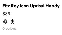
Icons below each product photo to display if sustainability, materials or fair trade was used
Simple description on each product page of the users specific impact when purchasing a piece of clothing
Clearly stating Teracot’s sustainable and ethical initiatives on their homepage as well as an about us page for further details.
Next Steps
Ideate
With a clear understanding of the company, potential user, and pain points they may have, I put together a sitemap to see how a user most likely would navigate through the website and how each page would relate to another.
Sitemap
Wireframe Sketching
I did a Crazy 8’s exercise to quickly come up with as many possible solutions for each page of the user flow.
With my sketches laid out, I began to develop several low-fidelity wireframes on Figma. These wireframes included the Homepage, Products Page, Product Details Page and checkout pages. I also designed both a mobile and tablet version.
Low-Fidelity
Mobile
Tablet
Homepage
Product page
Product details page
Low-fidelity wireframes
The next step in the process is to make a clickable prototype so that I can conduct user testing. Following this step allowed me to gather feedback regarding the product and iterate the designs before moving on to the High-Fidelity designs.
The low-fidelity prototype can be accessed here
Prototype
Test
I conducted two remote and one in person usability test using the low-fidelity prototypes. The three participants ages ranged between 24 and 55. I wanted to observe what challenges users were facing in the initial stages. I wanted to test the flow of the design, ease of navigation, and see if the sustainability information I included in the designs was considered transparent to the user.
Key findings from testing:
Participants expressed how they wish there was a reviews section to see how others liked or disliked the product
There was a need to explain more clearly what the logos meant in terms of materials used, fair trade, and recycled items
Participants wanted to understand the impact more of their sustainable shopping
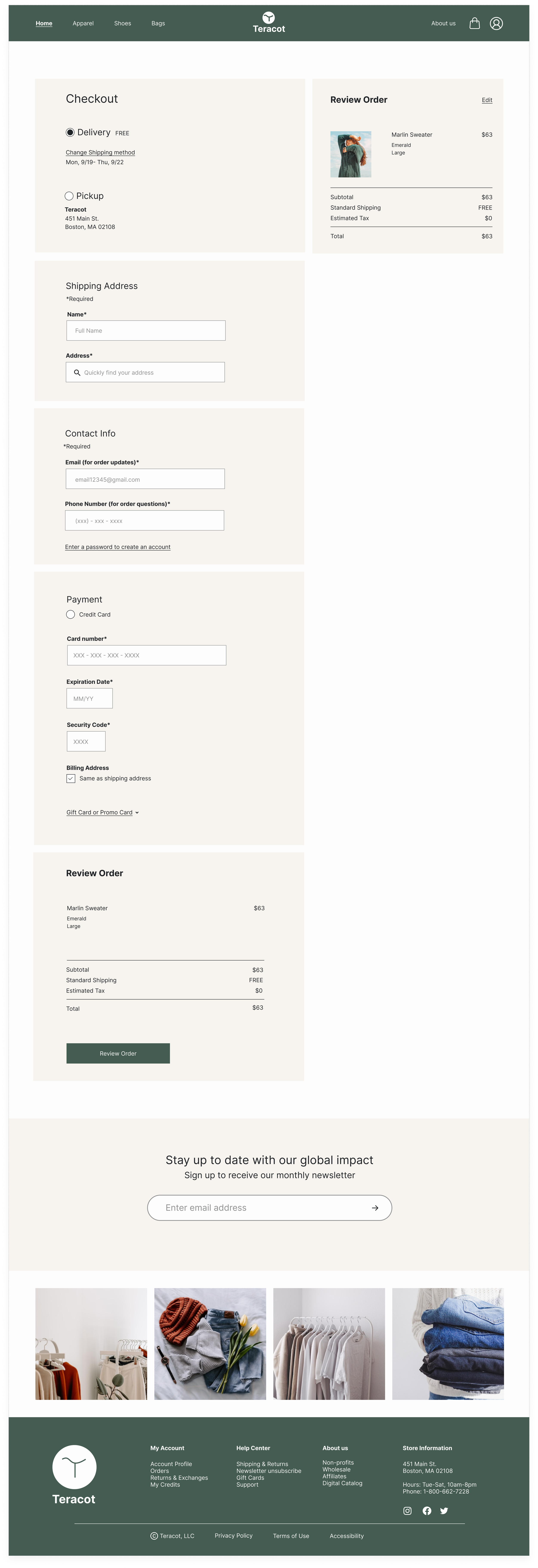
There was a need for an edit option at checkout, incase the user changed their mind
Iterate
After gathering all the feedback from the usability testing, I began to iterate my designs
Usability Testing
Before
Users wanted to know more information regarding what these icons meant
Users were not able to edit their selections at checkout
After
Additional explanation was added
An edit button was added
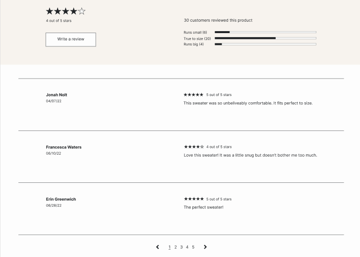
Users were frustrated that there were no reviews. A review section was added to the bottom of the Product Details Page.
Thoughts: Adding in a reviews section was part of my initial plan for the designs. I was too focused on other areas of my screens that I missed this step. The usability study helped to remind me to add this in.
Final Product
My final step was to create a High-fidelity prototype for desktop, tablet, and mobile. Follow the link below to experience the Teracot prototype.
High-fidelity Prototype
Accessibility
My initial designs did not incorporate as much accessibility as I would want to represent in my designs. I went back and altered the below to make sure I included everyone in my designs.
I added 2 additional ways to decipher what the icons meant on the homepage and product page. I did this by having an icon, color coding each icon and adding text.
I made sure the WCAG colors I chose were at least AA standards.
Conclusion
Teracot responsive website successfully eased users through the shopping experience with the confidence they needed to support a sustainable fashion retailer. I did this by eliminating points of frustration and offering clear information that exhibits the positive impact they are having in the world with every purchase.
Happy Shoppers
The project went in a different direction than I originally anticipated after I discovered who the primary user was. I had to narrow down the focus more.
Deciding which findings from the usability test were priority one and priority two. Some of the main priority ones were buttons that could not be clicked and other buttons that did not go to the correct place.
Areas of Improvement
Due to the constraints of a few areas of this project (time, access to users), I would love to circle back and improve the following areas.
Inclusivity- I had a small group of users to interview and test, ideally I would want to have a larger pool of users from different backgrounds, genders, races, ages, and abilities. I would also like to make sure the images for each product are inclusive and represent a wide range of people.
Accessibility- I would like to make more of my design accessible for those of varying abilities so that my designs work for all people. This would include alt text, screen readers, and different language options.
Spending time creating a dark mode for each screen size.
Write copy that was a little more empowering and strong but still friendly.
Challenges
Ready to elevate your ecommerce shop?
In order to create the best client experience, I only work on one project per month. Apply now to work together!


